How Your Store Looks
Upload your logo, pick your colors, choose a font, and set your hero banner.
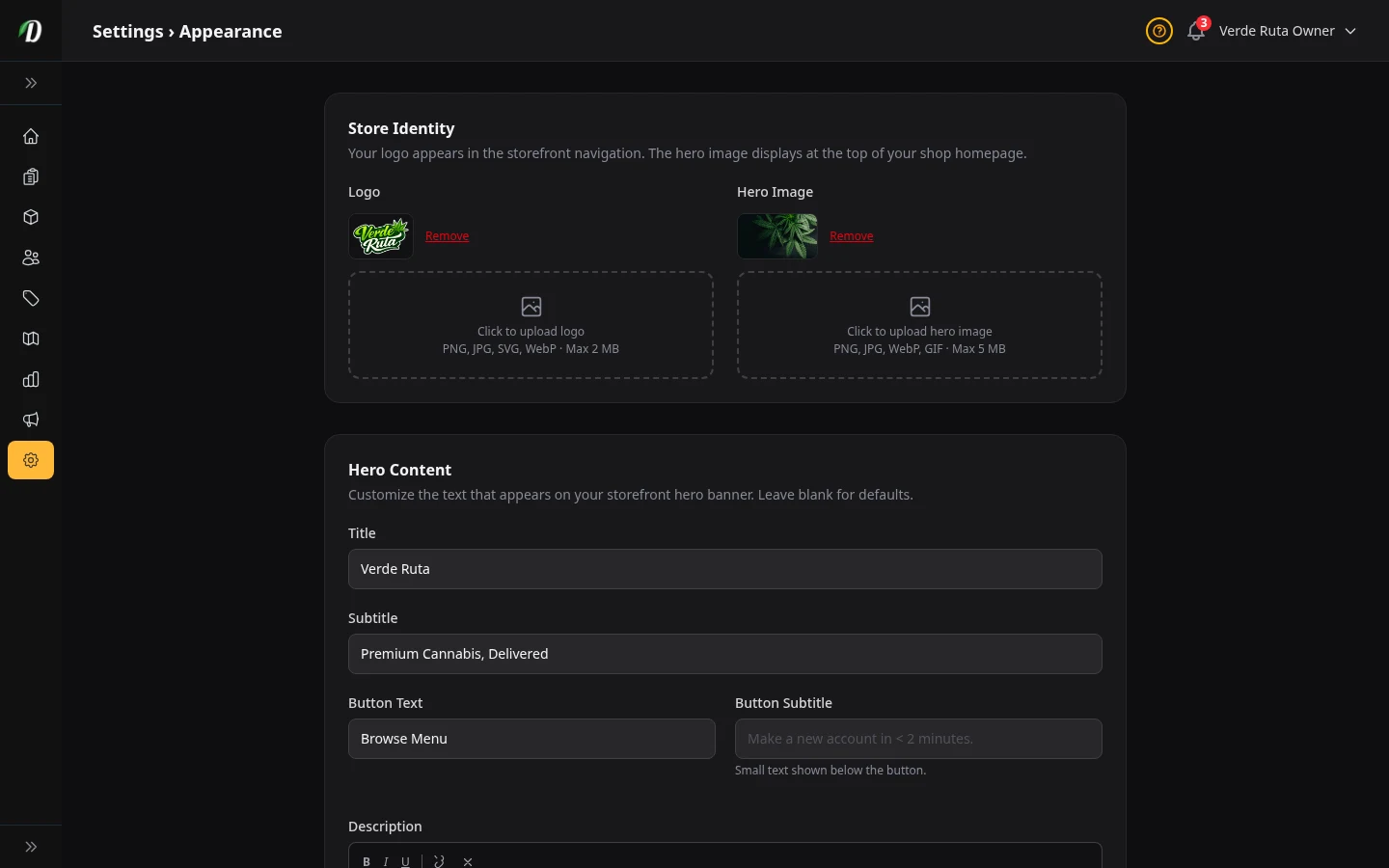
What this page does
This is where you make your store look like your store. Upload your logo, pick your brand colors, choose a font, and write the words on your homepage banner. Every change here only affects what your customers see — not your admin dashboard (unless you change the admin theme too).
When you modify any setting on this page, a sticky Unsaved changes bar appears at the bottom reminding you to save. Click Save Appearance in the bar to apply your changes, or navigate away to discard them.
Logo
Your logo shows at the top of your store — in the navigation bar that customers see on every page.
What to upload: A PNG, JPG, SVG, or WebP file. Keep it under 2 MB. A transparent PNG looks best. You can also click Choose from library to reuse an image from your Media Library and crop it to fit.
To remove it: Click the Remove link next to the logo preview. Your store will show your business name as text instead.
Your hero banner (the large image on your homepage) works the same way — upload a new file or choose one from your library, cropped to a wide 16:9 shape.
Hero Image
The hero image is the big banner at the very top of your store's homepage. It is the first thing customers see.
What to upload: A wide photo (PNG, JPG, WebP, or GIF). Up to 5 MB. Best size is 1440 pixels wide or bigger. The image gets cropped to fill the banner, so keep important stuff in the center.
To remove it: Click Remove next to the hero preview. A plain colored background will show instead.
Hero Content (the words on the banner)
You can put a title, subtitle, description, and a call-to-action button on top of the hero image. All fields are optional.
- Title
- The big headline. If you leave it blank, your business name shows instead.
- Subtitle
- A smaller line under the title. Example: "Delivered to Your Door."
- Description
- A short rich-text paragraph under the subtitle. Supports bold, italic, underline, and links. Keep it brief.
- Button Text
- The label on the call-to-action button. "Shop Now" is the default. The button takes customers to your products.
- Button Subtitle
- A small line of text that appears beneath the button. Use it for a tagline or secondary message, like "Free delivery over $50."
Brand Colors
Two colors control how your store looks.
- Primary Color
- Used for buttons, links, and important things customers click. Pick something that matches your brand.
- Accent Color
- Used for hover effects and small details. Usually a slightly different shade of your primary color.
Click the color circle to open the picker, or type a hex code like #28A745 directly.
Store Theme (Light or Dark)
Pick whether your customers see a light background or a dark background on your store. Click the preview tile you want and save.
This only changes your customer store. Your admin dashboard has its own theme switch below.
Admin Theme (Light or Dark)
This switches your own admin dashboard between light and dark mode. It does not affect what customers see. The change happens right after you save.
Store Font
Pick a font for all the text on your customer store — product names, headings, descriptions, everything.
Available fonts: Inter (default), Poppins, Roboto, Montserrat, Playfair Display, Raleway, Nunito, and Lexend.
The preview on the page updates as you change fonts, so you can see what each one looks like before you save.
Product Display Options
- Strain Bar Display
- Text shows "70% Indica" and "30% Sativa" at each end. Slider shows one big badge in the middle like "70% INDICA." Pick whichever is easier for your customers to read.
- Show out of stock products
- When turned on, products with no stock still show up on your store (marked as "Out of Stock"). When turned off, they disappear completely.
- Product Grid Columns
- Controls how many products appear side-by-side in the grid. Set Mobile Columns to 1 or 2 for phones, and Desktop Columns to 3, 4, or 5 for larger screens. More columns fit more products at a glance; fewer columns show bigger images.
- Lazy Load Products
- When turned on, products load with a "See More" button instead of traditional page numbers. Customers can scroll past the button at any time to reach the footer. Great for stores that want infinite-scroll-style browsing without hiding the footer.
- Default product sort
- Controls the order products appear when a customer first opens your store. Options include highest rated, highest THC, most popular, most margin, most net revenue, most gross revenue, most inventory, last updated, and on sale.
Guided Tours
- Admin dashboard tours
- Step-by-step tooltips that walk you through each admin page. On by default. You can restart any tour from the ? button at the top of each page.
- Customer storefront tours
- Guides first-time shoppers through zone selection, browsing, and checkout.
Frequently Asked Questions
How do I upload my logo in DabDash?
Go to Settings → Appearance, click Upload Logo, select a PNG, JPG, SVG, or WebP file under 2 MB, and save. Your logo appears in the storefront navigation bar. Use a transparent background PNG for the best result on both light and dark themes.
How do I change my store colors in DabDash?
In Settings → Appearance, use the Primary and Accent color pickers to set your brand colors. Primary color affects buttons and active links. Accent color affects hover states. A live preview of your storefront updates as you pick colors so you can see the result before saving.
How do I add a hero banner to my DabDash storefront?
Go to Settings → Appearance, upload a banner image (1440 pixels wide recommended), enter a title, subtitle, description text, and button label, then save. The banner appears at the top of your storefront homepage.