Revenue Overview
Track gross and net revenue, order counts, and average order value with trend charts and daily breakdowns.
Overview
The Revenue report is the default landing page for Analytics. It gives you a complete financial snapshot of your store for the selected date range — gross revenue, net revenue, order volume, and average order value at a glance.
Use this report for daily check-ins and weekly reviews. Switch between 7 Days, 30 Days, and 90 Days to zoom in or out. The selected range is preserved as you move between report tabs.
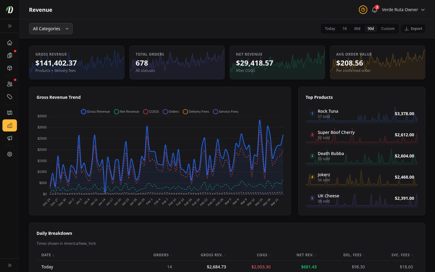
Stat Cards
Four stat cards at the top give you an instant performance snapshot. Each card includes a sparkline showing the trend over the selected period.
- Gross Revenue
- The total of all product sales plus delivery fees for confirmed and delivered orders. This is your top-line income before costs.
- Total Orders
- The number of orders placed in the period, regardless of status. Useful for understanding order volume trends.
- Net Revenue
- Gross revenue minus cost of goods sold (COGS). This tells you how much money is left after product costs. Requires cost prices to be set in your pricing structures.
- Avg Order Value
- Revenue divided by confirmed order count. A rising average means customers are spending more per visit.
Revenue Chart
The multi-metric chart plots up to six data series over the selected period. The active metric is shown as a solid line; other metrics appear as dashed lines for comparison.
- Gross Revenue
- Total product sales plus delivery fees per day.
- Net Revenue
- Gross revenue minus COGS per day.
- COGS
- Total cost of goods sold per day.
- Orders
- Number of orders placed per day.
- Delivery Fees
- Total delivery fees collected per day.
- Service Fees
- Total service fees collected per day.
Click any metric in the chart legend to switch the primary view. All other metrics remain visible as dashed reference lines.
Top Products
The sidebar card ranks your best-selling products by revenue for the selected period. Each entry shows the product name, quantity sold, total revenue, and an individual sparkline trend. Use this to quickly spot your highest-performing items without switching to the full By Product report.
Daily Breakdown
The table below the chart lists each day (or hour, for the 7-day range) with detailed columns. Click any column header to sort ascending or descending.
- Date / Hour
- The time period for this row. Recent dates show a badge with how many days ago.
- Orders
- Number of orders placed in that period.
- Gross Revenue
- Total product sales plus delivery fees.
- COGS
- Cost of goods sold. Hidden on mobile screens.
- Net Revenue
- Gross revenue minus COGS. Shown in green when positive, red when negative.
- Delivery Fees
- Total delivery fees collected. Hidden on mobile screens.
- Service Fees
- Total service fees collected. Hidden on mobile screens.
Filtering & Exporting
Use the Category dropdown to filter revenue by product category. Click the clear button to reset the filter and see all categories.
Click Export to download a CSV file with daily revenue totals, order counts, COGS, delivery fees, and service fees for the selected date range and category filter.
Tips
- Use the 7-day range for daily operations and the 30-day range for weekly reviews. The 90-day range is best for spotting seasonal trends.
- A consistently low average order value is a signal to review your freebie rules or minimum order thresholds — incentivise customers to add one more item to the cart.
- Compare the COGS and Net Revenue chart lines — if they are converging, your margins are shrinking and you may need to adjust pricing or supplier costs.
- Export the daily breakdown before monthly bookkeeping to reconcile revenue with your accounting system.
Frequently Asked Questions
What does the DabDash Revenue report show?
The Revenue report shows four stat cards — Gross Revenue, Total Orders, Net Revenue, and Average Order Value — each with sparkline trends. A multi-metric chart plots up to six metrics (gross revenue, net revenue, COGS, orders, delivery fees, service fees) over time. Below that, a daily breakdown table lists each day with order counts and revenue totals.
Can I filter DabDash analytics by date range?
Yes — use the 7 Day, 30 Day, and 90 Day preset buttons at the top of any analytics page. All charts, tables, and stat cards update instantly to show data for the selected period. The selected range is preserved as you switch between report tabs.
How do I filter DabDash revenue by product category?
Use the Category dropdown at the top of the Revenue page. Select a category to see only orders containing products in that category. Click the clear button to reset the filter and see all categories again.
Can I export DabDash revenue data?
Yes — click the Export button on the Revenue page to download a CSV file containing daily revenue totals, order counts, COGS, delivery fees, and service fees for the selected date range and category filter.